【IELTS英文】IELTS Writing Task 1 一文認識大魔王——冷門題型範文!


在雅思寫作測試 (IELTS Writing Task 1) 中,考生需要展示他們對各類數據的分析能力。除了上一篇所提及的柱狀圖、折線圖、圓形圖和表格等常見類型(重溫按這裏!)外,還有一些考生可能不太熟悉的題型,例如流程圖(Process Diagram)、地圖 (Map) 和混合數據 (Mixed Data)。這些題型雖然不如前者普遍,但掌握它們的寫作技巧同樣對提高雅思寫作分數至關重要。本篇文章將針對這三種題型提供範文,幫助大家在面對這幾種數據時更具信心。
冷門題型:流程圖 (Process Diagram)
You should spend about 20 minutes on this task.
Write at least 150 words.
範文:
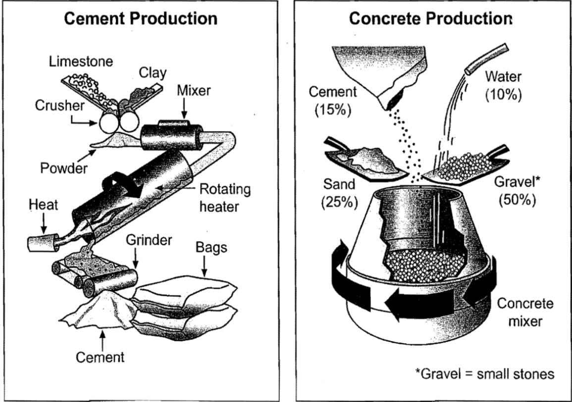
The diagrams depict the process and equipment involved in cement production, as well as how cement is utilized to create concrete.
In summary, limestone and clay undergo four key stages before being packaged as cement. Once produced, cement is mixed with three additional components to form concrete. While the cement-making process involves several tools, the creation of concrete is more straightforward and only requires a concrete mixer.
Initially, limestone and clay are crushed together to create a powder. This powder is then blended in a mixer before moving into a rotating heater, where consistent heat is applied at one end of the tube. The resultant mixture is then ground to produce cement, which is subsequently bagged for use.
As for the second diagram, concrete is primarily composed of gravel, accounting for 50% of its ingredients. The remaining components are 25% sand, 15% cement, and 10% water. These ingredients are all placed into a concrete mixer, which continuously rotates to thoroughly combine them, ultimately resulting in concrete.
冷門題型:地圖 (Map)
You should spend about 20 minutes on this task.
Write at least 150 words.
範文:
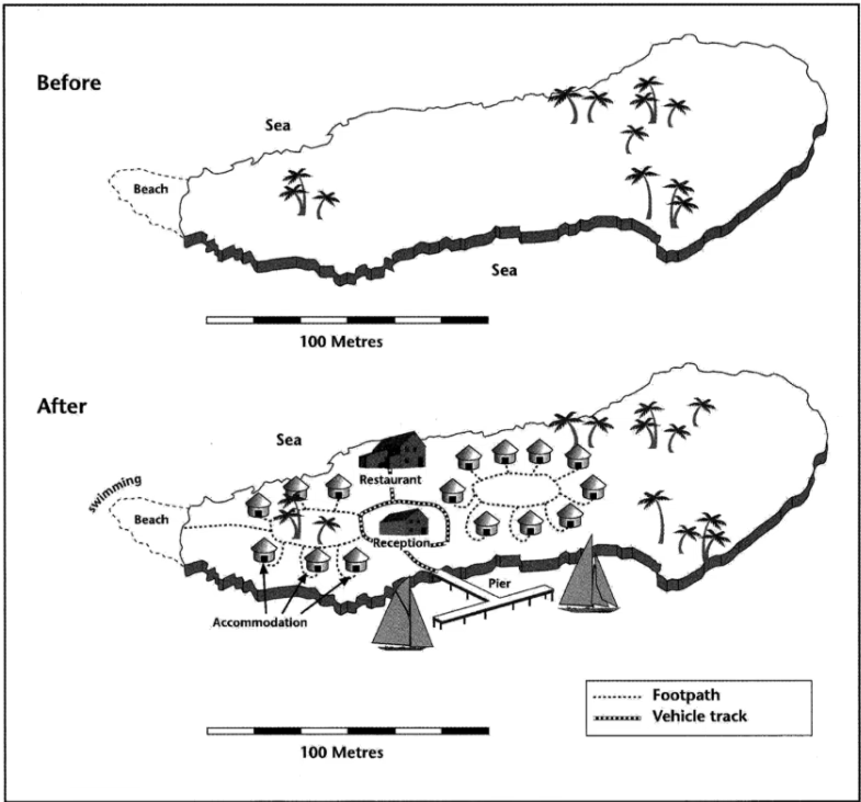
The two maps show the same island, with the first map depicting the area before construction and the second map illustrating it after the development for tourism.
Overall, comparing the two maps highlights significant transformations following this development. Not only have various facilities been built on the island, but the sea is also utilized for recreational activities. The newly developed island has effectively become an attractive destination for tourism.
Looking first at the initial map, we can see a large island with a beach located in the west. The total length of the island is approximately 250 meters. In contrast, the second map reveals significant changes, as numerous buildings have been constructed on the island. There are two distinct areas of accommodation: one situated in the west near the beach and the other located in the center of the island.
Between these two areas, there is a restaurant to the north and a central reception block, which is encircled by a vehicle track. This track leads down to the pier, where visitors can engage in sailing in the southern sea surrounding the island. Additionally, tourists can swim near the beach in the west. A footpath connects the western accommodation units to the beach, enhancing accessibility for guests.
冷門題型:混合數據 (Mixed Data)
You should spend about 20 minutes on this task.
Write at least 150 words.
範文1:
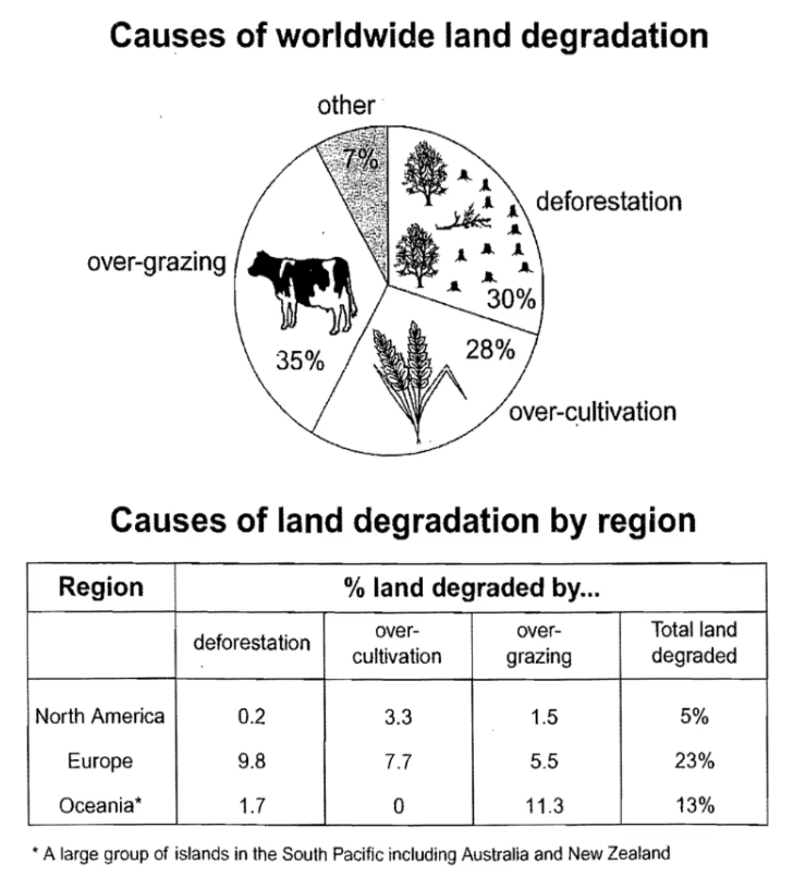
The pie chart illustrates the four primary causes of farmland degradation worldwide, while the table presents causes for it by region.
Overall, it is evident that Europe experienced more farmland degradation compared to other regions, primarily due to deforestation and over-cultivation.
On a global scale, animal grazing and tree clearance account for 65% of degradation, with excessive grazing responsible for 35% and tree clearance for 30%. Additionally, over-cultivation contributes to 28% of global degradation, while other factors collectively make up only 7%.
The impact of these causes varied across regions in the 1990s. Europe suffered 9.8% of its degradation from deforestation, whereas Oceania and North America experienced minimal effects, with only 1.7% and 0.2% of land affected, respectively. Europe, which had the highest overall percentage of degraded land at 23%, also faced challenges from over-cultivation (7.7%) and over-grazing (5.5%). In contrast, Oceania's 13% of degraded farmland was primarily due to over-grazing (11.3%). North America reported a lower rate of degradation at just 5%, mainly caused by over-cultivation (3.3%) and, to a lesser extent, over-grazing (1.5%).
You should spend about 20 minutes on this task.
Write at least 150 words.
範文2:
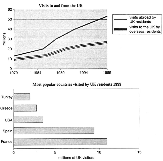
The line graph depicts the number of UK residents traveling abroad alongside overseas visitors to the UK from 1979 to 1999. Meanwhile, the bar chart shows the number of UK residents who traveled to five of the most favored countries in 1999, measured in millions.
In general, there was a noticeable increase in both inbound and outbound visits, with UK residents making more trips abroad than overseas residents visiting the UK during this period. Notably, in 1999, France emerged as the top destination for UK travelers.
From the line graph, it can be observed that the number of UK residents traveling overseas started at just under 15 million in 1979 and surged to over 50 million by 1999. Conversely, around 10 million overseas residents visited the UK initially, with this figure steadily rising to just below 30 million by the end of the period.
Turning to the bar chart, in 1999, France and Spain were the top two destinations, attracting 10 million and about 9 million UK visitors, respectively. The USA and Greece followed, each receiving around 4 million and 3 million visitors. Turkey was the least popular destination, with only about 2 million UK residents traveling there.
總括而言,無論是流程圖 (Process Diagram)、地圖 (Map) ,還是混合數據 (Mixed Data),還是之前介紹的柱狀圖 (Bar Chart)、折線圖 (Line Graph)、圓形圖 (Pie Chart)、表格 (Table),重溫按這裏!都能在雅思Writing Task 1中的成功關鍵在於清晰、準確地呈現信息都是各位考生的目標。希望本文提供的範文能夠幫助你更深入地理解這些題型,並為即將到來的雅思考試做好充分準備!如想了解更多關於IELTS考試的資訊,請密切留意Learnsmart 專欄更新!
如果大家有補習問題,如私人補習、線上補習,歡迎Follow 「學博教育中心 Learn Smart Education」 Facebook page & IG得到更多補習課程資訊,亦都可以上我們的補習網頁了解更多!
 學博小編
學博小編香港中學文憑試 (DSE) 的最新消息, 包括考試時間表、考試科目和評分制度的解讀、考試技巧和備試資源的分享,幫助你更好地應對考試。


